
The Anatomy of a High-Converting DTC Ad Creative, Explained
Break down the hook, offer, social proof and CTA behind high-converting DTC ad creative, and learn how to spot these patterns in competitor ads using
Chris Edington
15 min read
High-Converting DTC Ad Creative: The Anatomy of an Ad That Converts
A high-converting DTC ad creative usually has four building blocks: a hook that stops the scroll in the first three seconds, a clear offer, believable social proof, and a single CTA that tells people exactly what to do next. You can spot these patterns by studying competitor ads, and the ones that keep running for a long time deserve a second look. But longevity is a clue, not proof of profit. We'll get to the caveats.
If you run a DTC or eCommerce brand, you're probably already peeking at rivals' ads. This guide gives that habit some structure. We'll break down each of the four parts, show you how to spot them in the wild, and finish with a simple framework and checklist for your next batch of creative.
What Makes a High-Converting DTC Ad Creative? 🧩
Conversion comes from clarity, relevance and trust working in sequence, not from one clever trick. The viewer has to notice the ad (hook), understand what's on offer (offer), believe you (proof), and know what to do next (CTA). If any link is weak, the whole chain wobbles.
This surprises people: a single ad rarely nails all four. A brilliant hook gets wasted on a muddled offer. A generous offer with no proof reads like a gimmick. So strong brands tend to find one structure that works and keep iterating on it, swapping hooks, trying different offers and rotating proof points.
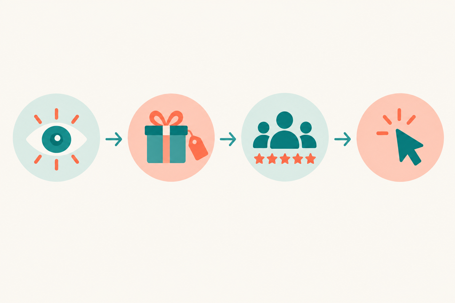
One honest note up front: public ad data shows what's running, not what's profitable. Treat everything you see as a hypothesis to test, not a verdict.
How to Find DTC Ads Worth Learning From
Before you can dissect good creative, you need to find it. Here's the process we'd follow.
- Start with the free tools. The Meta Ad Library, Google Ads Transparency Centre, TikTok Creative Center and LinkedIn's ad library are all good places to begin. They have limits, though. You check each brand manually, platform by platform, and none of them gives you week-by-week change history. They also don't reliably disclose spend, conversion rate or return on ad spend.
- Treat longevity as a weak-to-moderate clue. An ad that's still running after several weeks may have earned its budget, but there are other explanations. It could be low-spend, an evergreen brand campaign, a forgotten ad, or a long-running test. Use it to decide what to investigate, not what to copy.
- Look for variations around a single concept. When a brand runs several versions of one idea, with different openers, offers or formats, the team probably thinks the concept is worth developing. That doesn't show the concept is profitable, and you can't see spend, audience or campaign purpose.
- Track what's new, stopped and continuing, week over week. Manual scrolling gets painful here. A weekly diff can reveal which concepts get iterated and which disappear quickly. Ad monitoring tools can automate this, including ours, Rival Ads (more on that near the end).
- Look for patterns across several competitors. One brand's ad is an anecdote. The same hook type, offer structure or proof format showing up across five rivals is a much more useful signal.
Two practical tips. First, check ads in the right market. If you sell in the UK, look at what rivals run in the UK, because pricing, delivery claims, cultural references and regulations differ by country. Second, study creative by component rather than as a template. Google's ABCD framework for video creative (attention, branding, connection, direction) is a handy lens. Google reported that video ads following those principles were associated with 30% higher short-term sales. That's a broad video-ad finding, though, not a guarantee for your next campaign.
The Hook: How to Win the First 3 Seconds ⏱️
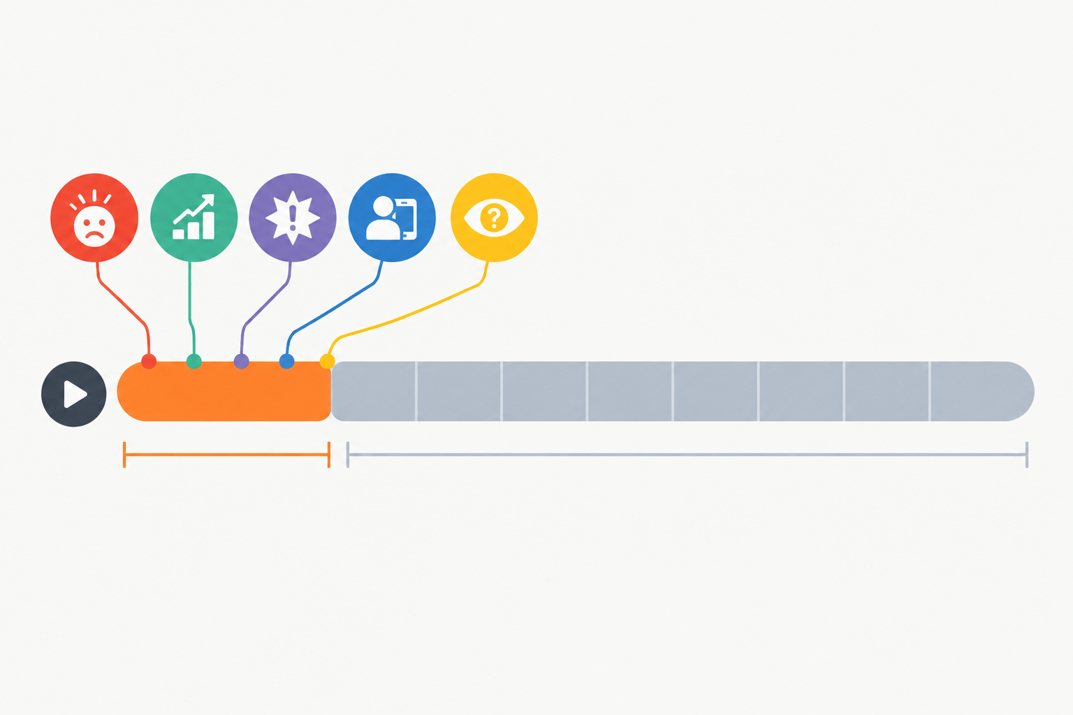
Mobile feeds move fast, and attention is the first thing you pay for. Facebook IQ analysis from 2016 reported that 47% of a video campaign's value was delivered in the first three seconds, and 74% in the first ten. That's platform-reported and dated, so take it as direction rather than gospel. Still, it matches what most media buyers will tell you: lose the opening, lose the ad. TikTok's own guidance recommends landing your hook within the first 3 to 6 seconds.
Common hook formats in DTC ads
When you scan competitor ads, the same handful of openers keeps turning up:
- Problem callout: names the pain directly ('Tired of dry skin by 3pm?')
- Bold result: leads with the outcome ('Down 8 lbs in a month')
- Pattern interrupt: something visually or audibly unexpected that breaks the scroll rhythm
- UGC-style 'I didn't expect this to work': a real-feeling person, a sceptical start, a surprised verdict
- Curiosity gap: a question or claim that makes people want the answer
- Direct offer lead: the deal is the hook ('Half-price until Sunday')
How to structure a winning ad hook
The simplest recipe is a visual stop plus a line that names the audience or problem. The visual stop could be movement, a face, strong contrast or a product in action. The line can be spoken or on-screen text, and it should work with the sound off, because plenty of people scroll silently. Skip the logo animation. Show the product, the problem or the benefit straight away.
A classic reference is Dollar Shave Club's launch video: founder-led, direct to camera, with a cheeky take on its low-cost razor proposition. It's a historic creative example, not proof that one hook caused a measured lift. But the devices you can borrow are easy to see: conversational delivery, a concrete claim and no wasted opening.
Platform tendencies for ad creative
These are common tendencies, not rules, so check them against your own audience and placement data.
- TikTok content often performs best when it feels native and lo-fi, because heavily polished ads can read as ads.
- Meta placements handle both static images and short video. The Meta Ad Library shows which one a given brand leans on.
- LinkedIn ads often favour B2B-style credibility: clear claims, a professional tone and specific numbers. That matters less for most DTC brands, but it's useful if you sell to businesses too.
Three illustrative DTC ad hook breakdowns
These are anonymised composites of patterns you'll commonly see, not specific brands.
- Skincare: close-up of a face in natural light, text overlay reading 'My skin before I stopped doing this one thing'. Visual stop plus curiosity gap.
- Supplements: a creator holding the tub, saying 'I was sure this would taste awful.' UGC-style, sceptic-turned-convert.
- Apparel: a split-screen fit comparison with 'Leggings that don't go see-through in a squat'. Problem callout with a visual demonstration.
A practical tip for testing ad hooks
When you test hooks, change only the first three seconds and keep the rest of the ad identical. That gives you the cleanest chance of isolating the hook's effect. It won't guarantee a clean answer, though. Platform delivery can send variants to different audiences, and small samples are noisy. Give each variant enough comparable delivery, and judge on downstream outcomes like click-through and conversion, not views alone.
The Offer: Clarity Over Cleverness 🎯
A clever offer that takes thirty seconds to decode tends to lose to a plain one. Within a few seconds, a stranger should understand what they get, what it costs and why now. Dollar Shave Club works as an example again. Humour carried the video, but the proposition was concrete: a razor plan from $1 a month. The joke supported the offer. It didn't replace it.
Common offer types in ecommerce ads
- Percentage discounts
- Bundles and multi-buy deals
- Free gifts with purchase
- Free delivery (or a free delivery threshold)
- Subscription savings
- Risk reversal: free returns, money-back guarantees, trial periods
Warby Parker's original Home Try-On, five frames to try at home for five days, is a nice historical example of risk reversal made specific: a set quantity, a set duration, nothing vague. (If you borrow the pattern, make your own terms explicit.)
UK-specific considerations for DTC ad offers
If you're advertising to UK shoppers, a few things deserve extra care.
- Show prices in pounds, including VAT. Nobody wants a surprise at checkout.
- Be upfront about delivery. Clear delivery times and costs build trust. You don't need to name a carrier, but if delivery speed is part of your pitch, say what customers can actually expect.
- Make returns easy to understand. Simple returns terms reduce hesitation, so state them plainly wherever you mention risk reversal.
- Follow the ASA's CAP Code. Section 3 on misleading advertising covers pricing and claims. Qualifications such as exclusions, minimum spend or subscription requirements should be clear and close to the headline. A '50% off' banner is a problem if the conditions are buried, and any 'was' price should be a genuine one you actually charged.
Price transparency matters commercially too. Baymard Institute's 2024 survey found that 48% of US online shoppers who abandoned a cart did so because extra costs like shipping, taxes or fees were too high. It's a US figure about cart abandonment, not ad wording, but the lesson travels: the price in your ad should match the price at the end of the journey.
How to spot offer testing in competitor ads
Two patterns hint at it. One is the same creative running with different offers ('20% off' next to 'free gift'). The other is rotating deadlines, where an ad gets refreshed with a new end date. Both suggest a brand is exploring which incentive works, though you can't see the results.
Reading a competitor's promotional rhythm
This is where weekly comparisons earn their keep. Over a few months you'll see the shape of a competitor's calendar: a Black Friday ramp-up that starts in early November, payday promotions near month-end, seasonal pushes like January fitness or summer holidays. Once you know their rhythm, you can plan around it. You can match it, or deliberately zig when they zag.
Social Proof That Actually Converts ⭐
Generic stars and vague claims ('Loved by thousands!') fall flat because they're easy to ignore. Specificity builds trust. A named customer describing a concrete result usually beats a golden banner.
The evidence for reviews is strong. Northwestern University's Spiegel Research Center found that products displaying reviews were 270% more likely to be purchased than products with none, and the effect was bigger for higher-priced items (380% versus 190% for lower-priced ones). That's a study of online purchase behaviour, not a promise for your ad, but it explains why proof deserves a place in your creative. Survey data points the same way. Stackla's 2021 report found 79% of consumers said user-generated content highly impacts their buying decisions, versus 13% for brand-created content (that's perceived influence, not a measured conversion difference).
Effective social proof formats for DTC ads
- Named customer reviews with real detail ('Cut my morning routine from 20 minutes to 5')
- Before-and-after, where compliant
- UGC testimonials, with the customer's permission
- Press mentions and expert endorsements
- Review counts and ratings, such as '4.8 from 12,000 reviews'
- Social activity, like 'bought X times this week', if it's true and verifiable
Match social proof to the customer objection
This is the bit many brands skip. Think about what's actually stopping someone buying.
- Price worries need value proof: cost-per-use, comparison, 'lasted me a year'.
- Efficacy worries need results proof: demonstrations, timelines, specific outcomes.
- Trust worries need reviews and guarantees: ratings, review volume, free returns.
As for placement, sceptical, cold audiences often benefit from proof early, even in the hook ('4.8 stars from 12,000 reviews, and here's why'). For warm audiences who already know you, proof can work well as a closer just before the CTA. Test both.
Keep customer testimonials and claims honest
The ASA and CAP Code expect testimonials to be genuine and claims to be substantiated, and you shouldn't imply that an exceptional result is typical. If creators or customers have been paid or gifted product, say so clearly where viewers will notice it, not behind a 'more' link. And never edit captions to suggest results someone didn't actually get.
When you study rivals, look at which proof types show up most in their longest-running creatives. If those ads lead with creator demonstrations rather than star ratings, that's a hypothesis about what their audience responds to, and it's worth testing in your own account.
The CTA That Closes ✅
One ad, one action. Every extra ask (shop now, follow us, read the blog, take the quiz) dilutes the response. Pick the single next step you want and make everything point at it.
Wording matters too. 'Get 20% off your first order' tells people exactly what happens and what they gain. 'Learn more' puts the work on them. Strong CTAs are specific, benefit-led and low-friction.
Then there's the landing page. The click shouldn't feel like a bait and switch. The headline, offer and imagery should echo the ad, and the price, discount and key conditions should be identical. If your ad promises 20% off and the product page doesn't mention it, you've paid for a click and lost a customer.
On urgency, stick to real deadlines and genuine stock limits. Fake countdown timers that reset on every visit erode trust and can fall foul of the ASA's rules on misleading claims.
Here's a bit of competitor research I like: click through the links on rivals' ads and see where they send traffic. A product page? A collection? A quiz? A dedicated landing page? When the same destination appears across several of a competitor's long-running ads, that's another clue about what they're betting on.
Putting It All Together: A DTC Ad Creative Framework
Here's how we'd turn all of this into a repeatable process.
- Write the hook first, and create three variations. Use different angles (problem, result, UGC-style) with the same body.
- State the offer in one sentence a stranger could repeat back. If they can't, simplify.
- Choose one piece of proof that answers the biggest objection. One, not six.
- Finish with a single, specific CTA that matches the landing page.
- Launch, then review competitor movements weekly. See what they've started, stopped and kept running, and treat it as input for your next test.
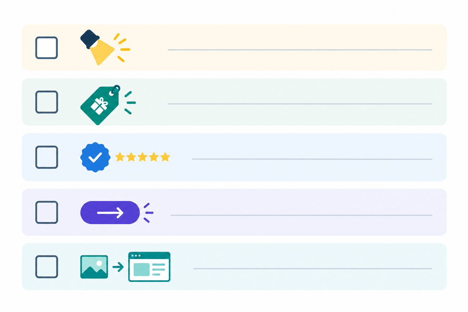
Pre-launch checklist for your DTC ad creative (screenshot this)
- ☐ Does the first three seconds work with the sound off?
- ☐ Does the hook name the audience, problem or result?
- ☐ Can someone repeat the offer back in one sentence?
- ☐ Is the price in pounds, VAT included, with delivery and returns clear?
- ☐ Is the proof specific, genuine and tied to a real objection?
- ☐ Is there exactly one CTA?
- ☐ Do the landing page headline, offer and imagery match the ad?
- ☐ Is any urgency real?
- ☐ Have I checked claims against ASA/CAP rules?
A quick worked example of a DTC ad
Take a fictional UK vitamin C serum brand. The hook is a creator in natural light saying, 'I stopped buying three serums and switched to one.' The offer is 'Try it for £22, free UK delivery, 30-day money-back guarantee', which packs price, delivery and risk reversal into one line. The proof is a named review ('My skin looked brighter after three weeks') plus '4.7 from 8,000 reviews', which answers the efficacy worry. The CTA is 'Get your first bottle for £22', pointing to a product page that repeats the same price and guarantee. Nothing fancy, and every part has a job.
Turning Competitor Ad Research Into a Habit 🔍
One-off swipe files go stale fast. The brands that learn the most from competitors treat it as a weekly routine, a bit like checking analytics. For each ad worth noting, log:
- Hook type, offer, proof type and CTA
- Format (static, video, carousel) and landing page
- How long it's been live
- What you don't know: audience, spend, results
That last line keeps you honest. You're building hypotheses to test, not facts about their performance.
A note on ad monitoring tools
We built Rival Ads to take some of the manual work out of this, so yes, we're biased, and you can do the same job with free ad libraries and a spreadsheet. You enter a competitor's website, and we look for their ads on Meta, Google, TikTok and LinkedIn, then show a weekly view of what's new, stopped and still running. Coverage depends on what each platform makes publicly visible, and our AI-generated analysis is meant to speed up your reading of those changes, not replace your own judgement. Plans start at $29 a month, and agencies can use the whitelabel option to share findings under their own brand.
Frequently Asked Questions About DTC Ad Creative
What makes a DTC ad convert well?
Most high-converting DTC ads combine a strong hook, a clear offer, believable social proof and a single CTA, then carry the same message through to the landing page. What they share is focus: one audience, one problem, one next step.
What elements should every ecommerce ad include?
At a minimum: a scroll-stopping opening, a clear product benefit, a specific reason to act, some form of proof and one obvious next step. For UK audiences, prices in pounds with VAT included, plus clear delivery and returns information, help build trust.
How do I structure a winning ad hook?
Pair a visual stop with a line that names the problem, audience or result in the first three seconds. Then test a few variations while keeping the rest of the ad the same, and give each one enough delivery before you draw conclusions.
How can I tell if a competitor's ad is actually working?
You can't know for certain from public data. Longevity and repeated variations are clues, but spend, audience and campaign goals are hidden, so a long-running ad might be low-budget or evergreen rather than a top performer. Look for patterns across several rivals, then validate ideas with your own tests.
Is it okay to copy competitor ads?
Learn from the structure, not the execution. Use rival ads to understand which hooks, offers and proof types are in play, then create original creative that reflects your own brand, product and substantiated claims. Copying assets or wording directly can create legal and brand risks.